React Native自定义控件底部抽屉菜单的示例
导读:本文共3408.5字符,通常情况下阅读需要11分钟。同时您也可以点击右侧朗读,来听本文内容。按键盘←(左) →(右) 方向键可以翻页。
摘要: 一、需求分析原生开发中,自定义View可谓是屡见不鲜的事情,往往系统的控件总不能满足现实的需求。五花八门的产品设计需要我们做出不同的View。关于自定义View的内容网上已经有很多的博文,本篇博客要和大家分享如何在React Native中自定义组件实现抽屉菜单控件效果。分享功能在App中的重要性想必是不言而喻的,那么RN中如何实现这种效果呢?React ... ...
目录
(为您整理了一些要点),点击可以直达。一、需求分析
原生开发中,自定义View可谓是屡见不鲜的事情,往往系统的控件总不能满足现实的需求。五花八门的产品设计需要我们做出不同的View。关于自定义View的内容网上已经有很多的博文,本篇博客要和大家分享如何在React Native中自定义组件实现抽屉菜单控件效果。分享功能在App中的重要性想必是不言而喻的,那么RN中如何实现这种效果呢?
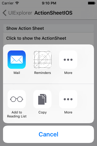
React Native 系统库中只提供了IOS的实现,即ActionSheetIOS.该控件的显示方式有两种实现:
(1)showActionSheetWithOptions
(2)showShareActionSheetWithOptions
第一种是在iOS设备上显示一个ActionSheet弹出框。第二种实现是在iOS设备上显示一个分享弹出框。借用官方的图片说明如下:

IOS设备上的实现系统已经提供了,接下来我们就需要如何适配Android。在原生开发中,自定义View也是有基本的流程:
(1)自定义控件类,继承View或系统控件。
(2)自定义属性
(3)获取自定义属性,并初始化一系列工具类
(4)重写onMeasure方法,对控件进行测量
(5)如果是自定义布局,还需要重写onLayout进行布局
在React Native中自定义组件的思路基本和原生自定义相似。所以按照这个流程,我们一步步实现即可。
二、功能实现
1、自定义组件,实现Component
export default class AndroidActionSheet extends Component
2、自定义属性
// 1.声明所需要的属性 static propTypes= { title: React.PropTypes.string, // 标题 content: React.PropTypes.object, // 内容 show: React.PropTypes.func, // 显示 hide: React.PropTypes.func, // 隐藏 } constructor(props) { super(props); this.translateY = 150; this.state = { visible: false, sheetAnim: new Animated.Value(this.translateY) } this.cancel = this.cancel.bind(this); } 3、实现基本布局
/** * Modal为最外层,ScrollView为内容层 */ render() { const { visible, sheetAnim } = this.state; return( <Modal visible={ visible } transparent={ true } animationType="none" onRequestClose={ this.cancel } > <View style={ styles.wrapper }> <TouchableOpacity style={styles.overlay} onPress={this.cancel}></TouchableOpacity> <Animated.View style={[styles.bd, {height: this.translateY, transform: [{translateY: sheetAnim}]}]}> { this._renderTitle() } <ScrollView horizontal={ true } showsHorizontalScrollIndicator={ false }> {this._renderContainer()} </ScrollView> </Animated.View> </View> </Modal> ) } 可以看到上面我们定义了基本的布局,布局中使用_renderTitle()方法来渲染标题部分,内容区域为ScrollView,并且为横向滚动,即当菜单项超过屏幕宽度时,可以横向滑动选择。在内部调用了renderContainer方法来渲染菜单:
/** * 标题 */ _renderTitle() { const { title,titleStyle } = this.props; if (!title) { return null } // 确定传入的是不是一个React Element,防止渲染的时候出错 if (React.isValidElement(title)) { return ( <View style={styles.title}>{title}</View> ) } return ( <Text style={[styles.titleText,titleStyle]}>{title}</Text> ) } /** * 内容布局 */ _renderContainer() { const { content } = this.props; return ( <View style={styles.container}> { content } </View> ) } 当我们需要点击Modal,进行关闭时,还需要处理关闭操作,Modal并没有为我们提供外部关闭处理,所以需要我们单独实现,从布局代码中我们看到TouchableOpacity作为遮罩层,并添加了单机事件,调用cancel来处理:
/** * 控制Modal点击关闭,Android返回键关闭 */ cancel() { this.hide(); } 4、自定义方法,对外调用
在外部我们需要控制控件的显示和隐藏,所以需要对外公开显示、关闭的方法:
/** * 显示 */ show() { this.setState({visible: true}) Animated.timing(this.state.sheetAnim, { toValue: 0, duration: 250 }).start(); } /** * 隐藏 */ hide() { this.setState({ visible: false }) Animated.timing(this.state.sheetAnim, { toValue: this.translateY, duration: 150 }).start(); } 5、使用
<ActionSheet ref='sheet' title='分享' content={this._renderContent()} /> 至此,我们自定义组件就完成了。整体来看,基本的原理还是很简单的,主要利用了自定义属性,传参,动画,就可以轻松的实现了。本篇博客重点不是为了让大家知道怎么去写出这个效果,而是让大家明白,当我们遇到一个需要自定义的实现时,该如何去一步步实现。
三、效果图

以上就是本文的全部内容,希望对大家的学习有所帮助,也希望大家多多支持。
</div> <div class="zixun-tj-product adv-bottom"></div> </div> </div> <div class="prve-next-news">React Native自定义控件底部抽屉菜单的示例的详细内容,希望对您有所帮助,信息来源于网络。