怎么在matplotlib中利用scatter方法画散点图
导读:本文共3470.5字符,通常情况下阅读需要12分钟。同时您也可以点击右侧朗读,来听本文内容。按键盘←(左) →(右) 方向键可以翻页。
摘要: 1、最简单的绘制方式绘制散点图是数据分析过程中的常见需求。python中最有名的画图工具是matplotlib,matplotlib中的scatter方法可以方便实现画散点图的需求。下面我们来绘制一个最简单的散点图。数据格式如下:0 7464031 12630432 9823603 1202602...其中第一列为X坐标,第二列为Y坐标。下面我们来画图。#!/u... ...
目录
(为您整理了一些要点),点击可以直达。1、最简单的绘制方式
绘制散点图是数据分析过程中的常见需求。python中最有名的画图工具是matplotlib,matplotlib中的scatter方法可以方便实现画散点图的需求。下面我们来绘制一个最简单的散点图。
数据格式如下:
0 746403
1 1263043
2 982360
3 1202602
...
其中第一列为X坐标,第二列为Y坐标。下面我们来画图。
#!/usr/bin/envpython#coding:utf-8importmatplotlib.pyplotaspltdefpltpicture():file="xxx"xlist=[]ylist=[]withopen(file,"r")asf:forlineinf.readlines():lines=line.strip().split()iflen(lines)!=2orint(lines[1])<100000:continuex,y=int(lines[0]),int(lines[1])xlist.append(x)ylist.append(y)plt.xlabel('X')plt.ylabel('Y')plt.scatter(xlist,ylist)plt.show()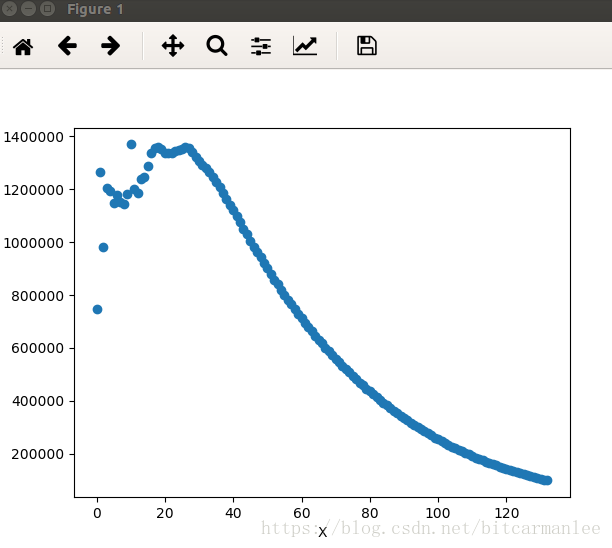
2、更漂亮一些的画图方式
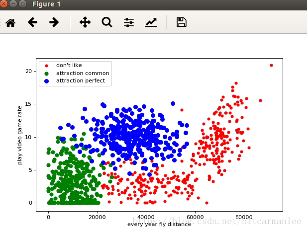
上面的图片比较粗糙,是最简单的方式,没有任何相关的配置项。下面我们再用另外一份数据集画出更漂亮一点的图。
数据集来自网络的公开数据集,数据格式如下:
40920 8.326976 0.953952 3
14488 7.153469 1.673904 2
26052 1.441871 0.805124 1
75136 13.147394 0.428964 1
...
第一列每年获得的飞行常客里程数;
第二列玩视频游戏所耗时间百分比;
第三列每周消费的冰淇淋公升数;
第四列为label:
1表示不喜欢的人
2表示魅力一般的人
3表示极具魅力的人
现在将每年获取的飞行里程数作为X坐标,玩视频游戏所消耗的事件百分比作为Y坐标,画出图。
frommatplotlibimportpyplotaspltfile="/home/mi/wanglei/data/datingTestSet2.txt"label1X,label1Y,label2X,label2Y,label3X,label3Y=[],[],[],[],[],[]withopen(file,"r")asf:forlineinf:lines=line.strip().split()iflen(lines)!=4:continuedistance,rate,label=lines[0],lines[1],lines[3]iflabel=="1":label1X.append(distance)label1Y.append(rate)eliflabel=="2":label2X.append(distance)label2Y.append(rate)eliflabel=="3":label3X.append(distance)label3Y.append(rate)plt.figure(figsize=(8,5),dpi=80)axes=plt.subplot(111)label1=axes.scatter(label1X,label1Y,s=20,c="red")label2=axes.scatter(label2X,label2Y,s=40,c="green")label3=axes.scatter(label3X,label3Y,s=50,c="blue")plt.xlabel("everyyearflydistance")plt.ylabel("playvideogamerate")axes.legend((label1,label2,label3),("don'tlike","attractioncommon","attractionperfect"),loc=2)plt.show()最后效果图:
3、scatter函数详解
我们来看看scatter函数的签名:
defscatter(self,x,y,s=None,c=None,marker=None,cmap=None,norm=None,vmin=None,vmax=None,alpha=None,linewidths=None,verts=None,edgecolors=None,**kwargs):"""Makeascatterplotof`x`vs`y`Markersizeisscaledby`s`andmarkercolorismappedto`c`Parameters----------x,y:array_like,shape(n,)Inputdatas:scalarorarray_like,shape(n,),optionalsizeinpoints^2.Defaultis`rcParams['lines.markersize']**2`.c:color,sequence,orsequenceofcolor,optional,default:'b'`c`canbeasinglecolorformatstring,orasequenceofcolorspecificationsoflength`N`,orasequenceof`N`numberstobemappedtocolorsusingthe`cmap`and`norm`specifiedviakwargs(seebelow).Notethat`c`shouldnotbeasinglenumericRGBorRGBAsequencebecausethatisindistinguishablefromanarrayofvaluestobecolormapped.`c`canbea2-DarrayinwhichtherowsareRGBorRGBA,however,includingthecaseofasinglerowtospecifythesamecolorforallpoints.marker:`~matplotlib.markers.MarkerStyle`,optional,default:'o'See`~matplotlib.markers`formoreinformationonthedifferentstylesofmarkersscattersupports.`marker`canbeeitheraninstanceoftheclassorthetextshorthandforaparticularmarker.cmap:`~matplotlib.colors.Colormap`,optional,default:NoneA`~matplotlib.colors.Colormap`instanceorregisteredname.`cmap`isonlyusedif`c`isanarrayoffloats.IfNone,defaultstorc`image.cmap`.norm:`~matplotlib.colors.Normalize`,optional,default:NoneA`~matplotlib.colors.Normalize`instanceisusedtoscaleluminancedatato0,1.`norm`isonlyusedif`c`isanarrayoffloats.If`None`,usethedefault:func:`normalize`.vmin,vmax:scalar,optional,default:None`vmin`and`vmax`areusedinconjunctionwith`norm`tonormalizeluminancedata.Ifeitherare`None`,theminandmaxofthecolorarrayisused.Noteifyoupassa`norm`instance,yoursettingsfor`vmin`and`vmax`willbeignored.alpha:scalar,optional,default:NoneThealphablendingvalue,between0(transparent)and1(opaque)linewidths:scalarorarray_like,optional,default:NoneIfNone,defaultsto(lines.linewidth,).verts:sequenceof(x,y),optionalIf`marker`isNone,theseverticeswillbeusedtoconstructthemarker.Thecenterofthemarkerislocatedat(0,0)innormalizedunits.Theoverallmarkerisrescaledby``s``.edgecolors:colororsequenceofcolor,optional,default:NoneIfNone,defaultsto'face'If'face',theedgecolorwillalwaysbethesameasthefacecolor.Ifitis'none',thepatchboundarywillnotbedrawn.Fornon-filledmarkers,the`edgecolors`kwargisignoredandforcedto'face'internally.Returns-------paths:`~matplotlib.collections.PathCollection`Otherparameters----------------kwargs:`~matplotlib.collections.Collection`propertiesSeeAlso--------plot:toplotscatterplotswhenmarkersareidenticalinsizeandcolorNotes-----*The`plot`functionwillbefasterforscatterplotswheremarkersdon'tvaryinsizeorcolor.*Anyorallof`x`,`y`,`s`,and`c`maybemaskedarrays,inwhichcaseallmaskswillbecombinedandonlyunmaskedpointswillbeplotted.Fundamentally,scatterworkswith1-Darrays;`x`,`y`,`s`,and`c`maybeinputas2-Darrays,butwithinscattertheywillbeflattened.Theexceptionis`c`,whichwillbeflattenedonlyifitssizematchesthesizeof`x`and`y`.Examples--------..plot::mpl_examples/shapes_and_collections/scatter_demo.py"""
其中具体的参数含义如下:
x,y是相同长度的数组。
s可以是标量,或者与x,y长度相同的数组,表明散点的大小。默认为20。
c即color,表示点的颜色。
marker 是散点的形状。
</div> <div class="zixun-tj-product adv-bottom"></div> </div> </div> <div class="prve-next-news">怎么在matplotlib中利用scatter方法画散点图的详细内容,希望对您有所帮助,信息来源于网络。