uniapp组件uni-popup弹出层怎么用
导读:本文共3446字符,通常情况下阅读需要11分钟。同时您也可以点击右侧朗读,来听本文内容。按键盘←(左) →(右) 方向键可以翻页。
摘要: 一、基本用法<template> <view> <buttontype="primary"@click="toggle('top')">顶部弹出</button> <buttontype="primary... ...
音频解说
目录
(为您整理了一些要点),点击可以直达。一、基本用法
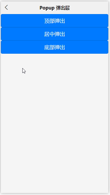
<template> <view> <buttontype="primary"@click="toggle('top')">顶部弹出</button> <buttontype="primary"@click="toggle('center')">居中弹出</button> <buttontype="primary"@click="toggle('bottom')">底部弹出</button> <uni-popupref="popup":type="type":animation="false":maskClick="true"@change="change"> <view> popup内容,此示例没有动画效果 </view> </uni-popup> </view></template><script>exportdefault{ data(){ return{ type:'top' }; }, methods:{ toggle(type){ this.type=type; this.$refs['popup'].open(); }, change(e){ uni.showToast({ title:'popup:'+e.type+',状态:'+e.show }) } }};</script>二、自定义弹出层(dialog + message) 示例
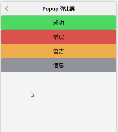
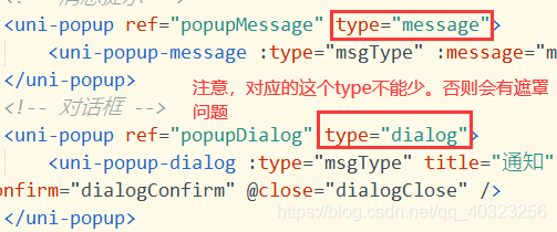
<template> <view> <button@click="toggleMessage('success')">成功</button> <button@click="toggleMessage('error')">错误</button> <button@click="toggleMessage('warn')">警告</button> <button@click="toggleMessage('info')">信息</button> <!--消息提示--> <uni-popupref="popupMessage"type="message"> <uni-popup-message:type="msgType":message="message":duration="700"/> </uni-popup> <!--对话框--> <uni-popupref="popupDialog"type="dialog"> <uni-popup-dialog:type="msgType"title="通知"content="欢迎使用uni-popup!":before-close="true"@confirm="dialogConfirm"@close="dialogClose"/> </uni-popup> </view></template><script>exportdefault{ data(){ return{ msgType:'success', message:'这是一条成功消息提示' }; }, methods:{ toggleMessage(type){ this.msgType=type; switch(type){ case'success': this.message='这是一条成功消息提示'; break; case'warn': this.message='这是一条警告消息提示'; break; case'info': this.message='这是一条消息提示'; break; case'error': this.message='这是一条错误消息提示'; break; } this.$refs['popupDialog'].open(); }, dialogConfirm(){ this.$refs.popupMessage.open(); this.$refs['popupDialog'].close(); }, dialogClose(){ this.msgType='info'; this.message='点击了对话框的取消按钮'; this.$refs.popupMessage.open(); this.$refs.popupDialog.close(); } }};</script>三、提交信息 (input + 延迟关闭)
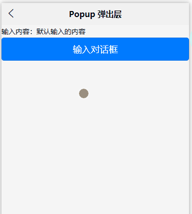
<template> <view> 输入内容:{{value}} <buttontype="primary"@click="confirmDialog">输入对话框</button> <uni-popupref="dialogInput"type="dialog"> <uni-popup-dialogmode="input"title="输入内容"value="对话框预置提示内容!"placeholder="请输入内容"@confirm="dialogInputConfirm"/> </uni-popup> </view></template><script> exportdefault{ data(){ return{ msgType:'success', value:'默认输入的内容' } }, methods:{ confirmDialog(){ this.$refs['dialogInput'].open() }, dialogConfirm(done){ this.$refs['popupMessage'].open() }, dialogInputConfirm(val){ uni.showLoading({ title:'1秒后会关闭' }) this.value=val setTimeout(()=>{ uni.hideLoading() },1000) } }, }</script>四、底部分享示例
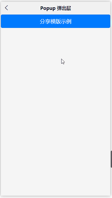
<template> <view> <buttontype="primary"@click="confirmShare">分享模版示例</button> <uni-popupref="popupShare"type="share"> <uni-popup-sharetitle="分享到"@select="select"></uni-popup-share> </uni-popup> </view></template><script> exportdefault{ data(){ return{ } }, methods:{ confirmShare(){ this.$refs.popupShare.open() }, select(e){ uni.showToast({ title:`您选择了第${e.index+1}项:${e.item.text}`, icon:'none' }) } }, }</script> </div> <div class="zixun-tj-product adv-bottom"></div> </div> </div> <div class="prve-next-news">本文:
uniapp组件uni-popup弹出层怎么用的详细内容,希望对您有所帮助,信息来源于网络。