Vue前端项目自适应布局怎么实现
导读:本文共2706字符,通常情况下阅读需要9分钟。同时您也可以点击右侧朗读,来听本文内容。按键盘←(左) →(右) 方向键可以翻页。
摘要: 一、单位尺寸px%vw、vh: 窗口em: 针对父元素的font-sizerem:“root em”的缩写,是一个相对长度单位;rem单位作用于非根元素时,相对于根元素(html)字体大小,rem单位作用于根元素字体大小时,相对于其出初始字体大小。说明:谷歌浏览器,字体的默认大小是16px;如果父元素item1的font-size=50px,那么子元素item2... ...
目录
(为您整理了一些要点),点击可以直达。一、单位尺寸
px
%
vw、vh: 窗口
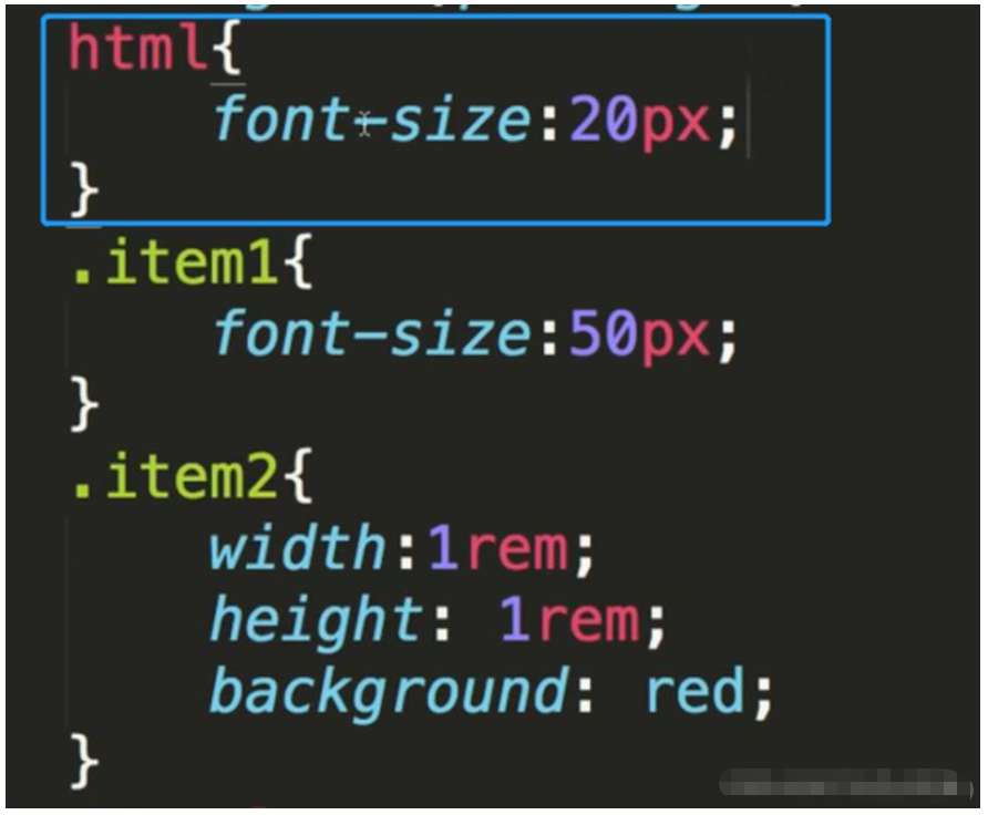
em: 针对父元素的font-size
rem:“root em”的缩写,是一个相对长度单位;rem单位作用于非根元素时,相对于根元素(html)字体大小,rem单位作用于根元素字体大小时,相对于其出初始字体大小。
说明:
谷歌浏览器,字体的默认大小是16px;
如果父元素item1的font-size=50px,那么子元素item2的1em=50px。
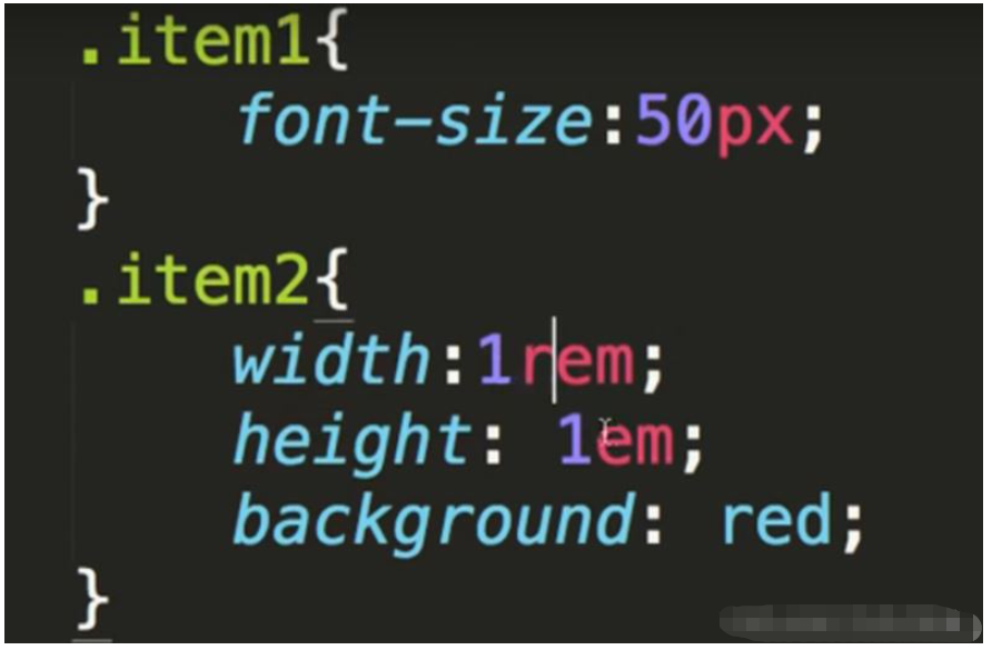
如果html的顶层font-size为20px; 那么子元素item2的1rem就为20px。
二、基于rem实现自适应布局
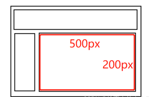
假设页面的根元素,font-size的大小没有设置,默认为16px。
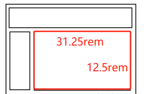
经过设计,我们的页面主体部分宽为500px; 高为200px。要想转换为自适应布局,我们只需要将px转换为rem就可以。
转换后:
宽为:500/16rem
高为:200/16rem
附:html5页面 的rem 布局适配方法
rem 布局适配方案
主要方法为:
按照设计稿与设备宽度的比例,动态计算并设置 html 根标签的 font-size 大小;
css 中,设计稿元素的宽、高、相对位置等取值,按照同等比例换算为 rem 为单位的值;
设计稿中的字体使用 px 为单位,通过媒体查询稍作调整。
1 动态设置 html 标签 font-size 大小
精简通用版本:
!(function(win,doc){functionsetFontSize(){//获取window宽度//zepto实现$(window).width()就是这么干的varwinWidth=window.innerWidth;//doc.documentElement.style.fontSize=(winWidth/640)*100+'px';//640宽度以上进行限制需要css进行配合varsize=(winWidth/640)*100;doc.documentElement.style.fontSize=(size<100?size:100)+'px';}varevt='onorientationchange'inwin?'orientationchange':'resize';vartimer=null;win.addEventListener(evt,function(){clearTimeout(timer);timer=setTimeout(setFontSize,300);},false);win.addEventListener("pageshow",function(e){if(e.persisted){clearTimeout(timer);timer=setTimeout(setFontSize,300);}},false);//初始化setFontSize();}(window,document));高配精确版本:
(function(WIN){varsetFontSize=WIN.setFontSize=function(_width){vardocEl=document.documentElement;//获取当前窗口的宽度varwidth=_width||docEl.clientWidth;//docEl.getBoundingClientRect().width;//大于1080px按1080if(width>1080){width=1080;}varrem=width/10;console.log(rem);docEl.style.fontSize=rem+'px';//误差、兼容性处理varactualSize=win.getComputedStyle&&parseFloat(win.getComputedStyle(docEl)["font-size"]);if(actualSize!==rem&&actualSize>0&&Math.abs(actualSize-rem)>1){varremScaled=rem*rem/actualSize;docEl.style.fontSize=remScaled+'px';}}vartimer;functiondbcRefresh(){clearTimeout(timer);timer=setTimeout(setFontSize,100);}//窗口更新动态改变font-sizeWIN.addEventListener('resize',dbcRefresh,false);//页面显示时计算一次WIN.addEventListener('pageshow',function(e){if(e.persisted){dbcRefresh()}},false);setFontSize();})(window)//对H5活动推过页面,宽高比例有所要求,可适当调整functionadjustWarp(warpId='#warp'){const$win=$(window);constheight=$win.height();letwidth=$win.width();//考虑导航栏情况if(width/height<360/600){return;}width=Math.ceil(height*360/640);$(warpId).css({height,width,postion:'relative',top:0,left:'auto',margin:'0auto'});//重新计算remwindow.setFontSize(width);}2 通过 CSS3媒体查询设置 rem
简单易用 缺乏灵活度 请看demo 你懂的
@mediascreenand(min-width:320px){html{font-size:50px}}@mediascreenand(min-width:360px){html{font-size:56.25px}}@mediascreenand(min-width:375px){html{font-size:58.59375px}}@mediascreenand(min-width:384px){html{font-size:60px}}@mediascreenand(min-width:400px){html{font-size:62.5px}}@mediascreenand(min-width:414px){html{font-size:64.6875px}}@mediascreenand(min-width:424px){html{font-size:66.25px}}@mediascreenand(min-width:480px){html{font-size:75px}}@mediascreenand(min-width:540px){html{font-size:84.375px}}@mediascreenand(min-width:640px){html{font-size:100px}} </div> <div class="zixun-tj-product adv-bottom"></div> </div> </div> <div class="prve-next-news">Vue前端项目自适应布局怎么实现的详细内容,希望对您有所帮助,信息来源于网络。