怎么使用python绘制带趋势线的散点图和边缘直方图
导读:本文共1943.5字符,通常情况下阅读需要6分钟。同时您也可以点击右侧朗读,来听本文内容。按键盘←(左) →(右) 方向键可以翻页。
摘要: 一、绘制带趋势线的散点图实现功能:在散点图上添加趋势线(线性拟合线)反映两个变量是正相关、负相关或者无相关关系。实现代码:importpandasaspdimportmatplotlibasmplimportmatplotlib.pyplotaspltimportseabornassnsimportwarningswarnings.filterwarn... ...
音频解说
目录
(为您整理了一些要点),点击可以直达。一、绘制带趋势线的散点图
实现功能:
在散点图上添加趋势线(线性拟合线)反映两个变量是正相关、负相关或者无相关关系。
实现代码:
importpandasaspdimportmatplotlibasmplimportmatplotlib.pyplotaspltimportseabornassnsimportwarningswarnings.filterwarnings(action='once')plt.style.use('seaborn-whitegrid')sns.set_style("whitegrid")print(mpl.__version__)print(sns.__version__)defdraw_scatter(file):#ImportDatadf=pd.read_csv(file)df_select=df.loc[df.cyl.isin([4,8]),:]#Plotgridobj=sns.lmplot(x="displ",y="hwy",hue="cyl",data=df_select,height=7,aspect=1.6,palette='Set1',scatter_kws=dict(s=60,linewidths=.7,edgecolors='black'))#Decorationssns.set(,font_scale=1.5)gridobj.set(xlim=(0.5,7.5),ylim=(10,50))gridobj.fig.set_size_inches(10,6)plt.tight_layout()plt.title("Scatterplotwithlineofbestfitgroupedbynumberofcylinders")plt.show()draw_scatter("F:\数据杂坛\datasets\mpg_ggplot2.csv")实现效果:
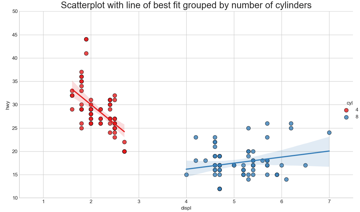
在散点图上添加趋势线(线性拟合线)反映两个变量是正相关、负相关或者无相关关系。红蓝两组数据分别绘制出最佳的线性拟合线。
二、绘制边缘直方图
实现功能:
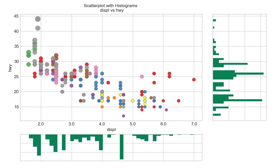
python绘制边缘直方图,用于展示X和Y之间的关系、及X和Y的单变量分布情况,常用于数据探索分析。
实现代码:
importpandasaspdimportmatplotlibasmplimportmatplotlib.pyplotaspltimportseabornassnsimportwarningswarnings.filterwarnings(action='once')plt.style.use('seaborn-whitegrid')sns.set_style("whitegrid")print(mpl.__version__)print(sns.__version__)defdraw_Marginal_Histogram(file):#ImportDatadf=pd.read_csv(file)#CreateFigandgridspecfig=plt.figure(figsize=(10,6),dpi=100)grid=plt.GridSpec(4,4,hspace=0.5,wspace=0.2)#Definetheaxesax_main=fig.add_subplot(grid[:-1,:-1])ax_right=fig.add_subplot(grid[:-1,-1],xticklabels=[],yticklabels=[])ax_bottom=fig.add_subplot(grid[-1,0:-1],xticklabels=[],yticklabels=[])#Scatterplotonmainaxax_main.scatter('displ','hwy',s=df.cty*4,c=df.manufacturer.astype('category').cat.codes,alpha=.9,data=df,cmap="Set1",edgecolors='gray',linewidths=.5)#histogramontherightax_bottom.hist(df.displ,40,histtype='stepfilled',orientation='vertical',color='#098154')ax_bottom.invert_yaxis()#histograminthebottomax_right.hist(df.hwy,40,histtype='stepfilled',orientation='horizontal',color='#098154')#Decorationsax_main.set(title='ScatterplotwithHistograms\ndisplvshwy',xlabel='displ',ylabel='hwy')ax_main.title.set_fontsize(10)foritemin([ax_main.xaxis.label,ax_main.yaxis.label]+ax_main.get_xticklabels()+ax_main.get_yticklabels()):item.set_fontsize(10)xlabels=ax_main.get_xticks().tolist()ax_main.set_xticklabels(xlabels)plt.show()draw_Marginal_Histogram("F:\数据杂坛\datasets\mpg_ggplot2.csv")实现效果:
</div> <div class="zixun-tj-product adv-bottom"></div> </div> </div> <div class="prve-next-news">本文:
怎么使用python绘制带趋势线的散点图和边缘直方图的详细内容,希望对您有所帮助,信息来源于网络。