怎么样使用纯CSS代码实现冰棍的动画效果
导读:本文共1774字符,通常情况下阅读需要6分钟。同时您也可以点击右侧朗读,来听本文内容。按键盘←(左) →(右) 方向键可以翻页。
摘要: 代码解读 定义dom,容器中包含2个元素: <divclass="ice-lolly"> <divclass="flavors"></div> <divclass="stick"></di... ...
目录
(为您整理了一些要点),点击可以直达。代码解读
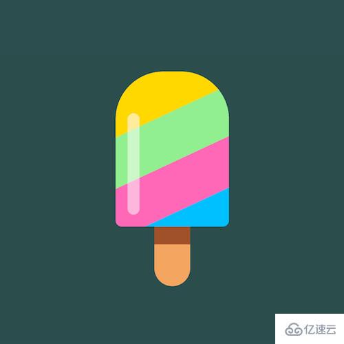
定义dom,容器中包含2个元素:
<divclass="ice-lolly">
<divclass="flavors"></div>
<divclass="stick"></div>
</div>
居中显示:
body{
margin:0;
height:100vh;
display:flex;
align-items:center;
justify-content:center;
background-color:darkslategray;
}
绘制出冰棍的外形:
.flavors{
width:19em;
height:26em;
font-size:10px;
border-radius:8em8em1em1em;
}
给冰棍上色:
.flavors{
position:relative;
overflow:hidden;
}
.flavors::before{
content:'';
position:absolute;
width:140%;
height:120%;
background:linear-gradient(
hotpink0%,
hotpink25%,
deepskyblue25%,
deepskyblue50%,
gold50%,
gold75%,
lightgreen75%,
lightgreen100%);
z-index:-1;
left:-20%;
transform:rotate(-25deg);
}
来一点光照效果:
.flavors::after{
content:'';
position:absolute;
width:2em;
height:17em;
background-color:rgba(255,255,255,0.5);
left:2em;
bottom:2em;
border-radius:1em;
}
画出冰棍筷子:
.stick{
position:relative;
width:6em;
height:8em;
background-color:sandybrown;
left:calc(50%-6em/2);
border-radius:003em3em;
}
给冰棍筷子加一点阴影,增加立体感:
.stick::after{
content:'';
position:absolute;
width:inherit;
height:2.5em;
background-color:sienna;
}
让冰棍的色彩滚动起来:
.flavors::before{
animation:moving100slinearinfinite;
}
@keyframesmoving{
to{
background-position:01000vh;
}
}
最后,增加交互效果,当鼠标悬停时才播放动画:
.flavors::before{
animation-play-state:paused;
}
.ice-lolly:hover.flavors::before{
animation-play-state:running;
}
</div> <div class="zixun-tj-product adv-bottom"></div> </div> </div> <div class="prve-next-news">怎么样使用纯CSS代码实现冰棍的动画效果的详细内容,希望对您有所帮助,信息来源于网络。