怎么使用纯CSS代码实现带有金属光泽的立体按钮的动画效果
导读:本文共1492字符,通常情况下阅读需要5分钟。同时您也可以点击右侧朗读,来听本文内容。按键盘←(左) →(右) 方向键可以翻页。
摘要: 代码解读 在dom中定义一个容器: <divclass="box">BUTTON</div> 容器居中显示: html,body{ height:100%; display:flex; align-items:center... ...
目录
(为您整理了一些要点),点击可以直达。代码解读
在dom中定义一个容器:
<divclass="box">BUTTON</div>
容器居中显示:
html,body{
height:100%;
display:flex;
align-items:center;
justify-content:center;
background-color:skyblue;
}
设置按钮的2d样式,为了便于调整按钮尺寸,使用了变量:
.box{
background:linear-gradient(toright,gold,darkorange);
color:white;
--width:250px;
--height:calc(var(--width)/3);
width:var(--width);
height:var(--height);
text-align:center;
line-height:var(--height);
font-size:calc(var(--height)/2.5);
font-family:sans-serif;
letter-spacing:0.2em;
border:1pxsoliddarkgoldenrod;
border-radius:2em;
}
设置按钮的3d样式:
.box{
transform:perspective(500px)rotateY(-15deg);
text-shadow:6px3px2pxrgba(0,0,0,0.2);
box-shadow:2px005pxrgba(0,0,0,0.2);
}
定义按钮的鼠标划过动画效果:
.box:hover{
transform:perspective(500px)rotateY(15deg);
text-shadow:-6px3px2pxrgba(0,0,0,0.2);
box-shadow:-2px005pxrgba(0,0,0,0.2);
}
.box{
transition:0.5s;
}
用伪元素增加光泽:
.box{
position:relative;
}
.box::before{
content:'';
position:absolute;
width:100%;
height:100%;
background:linear-gradient(toright,transparent,white,transparent);
left:0;
}
定义光泽动画效果:
.box::before{
left:-100%;
transition:0.5s;
}
.box:hover::before{
left:100%;
}
最后,隐藏容器之外的内容:
.box{
overflow:hidden;
}
大功告成!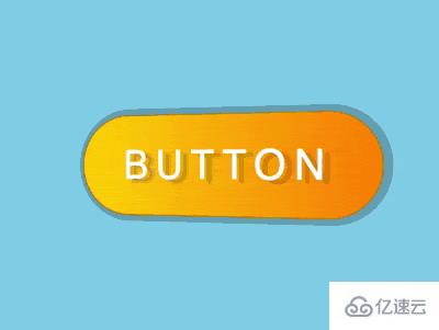
</div> <div class="zixun-tj-product adv-bottom"></div> </div> </div> <div class="prve-next-news">怎么使用纯CSS代码实现带有金属光泽的立体按钮的动画效果的详细内容,希望对您有所帮助,信息来源于网络。