CSS怎么绘制一只萌萌哒的大熊猫
导读:本文共2456.5字符,通常情况下阅读需要8分钟。同时您也可以点击右侧朗读,来听本文内容。按键盘←(左) →(右) 方向键可以翻页。
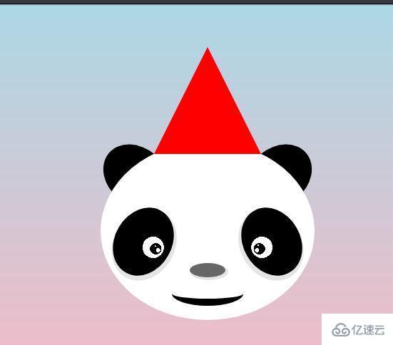
摘要: html代码: <pclass="panda"> <spanclass="hat"></span> <spanclass="earearL"></span> <spanclas... ...
目录
(为您整理了一些要点),点击可以直达。html代码:
<pclass="panda">
<spanclass="hat"></span>
<spanclass="earearL"></span>
<spanclass="earearR"></span>
<spanclass="face">
<spanclass="eyeseyesLeft"></span>
<spanclass="eyeseyesRight"></span>
<spanclass="nose"></span>
<spanclass="mouth"></span>
</span>
</p>
代码详解:
一、制作帽子
使用边框制作三角形,用伪类制作帽子上面的小球
.hat{
position:absolute;
border-bottom:150pxsolidred;
border-left:75pxsolidtransparent;
border-right:75pxsolidtransparent;
left:75px;
z-index:2;
}
.hat::before{
content:"";
position:absolute;
width:30px;
height:30px;
border-radius:50%;
background-color:#fff;
left:-15px;
top:-8px;
}
二、制作熊猫脸哈哈哈
.face{
position:absolute;
width:300px;
height:250px;
background-color:#fff;
border-radius:50%;
top:133px;
}
三、制作眼睛
使用径向渐变制作,因为两只眼睛旋转的对称的,所以使用了变量控制旋转,加了阴影使眼睛更逼真
.eyes{
position:absolute;
width:100px;
height:80px;
border-radius:50%;
transform:rotate(calc(-60deg*var(--n)));
}
.eyesLeft{
left:10px;
top:100px;
--n:1;
background:radial-gradient(circleat53%72%,#fff1px,transparent1px),radial-gradient(circleat50%80%,#fff3px,transparent3px),radial-gradient(circleat50%75%,#0008px,transparent8px),radial-gradient(circleat50%70%,white15px,transparent15px),#000;
box-shadow:-3px3px03pxrgba(0,0,0,.1);
}
.eyesRight{
right:10px;
top:100px;
--n:-1;
background:radial-gradient(circleat45%74%,#fff1px,transparent1px),radial-gradient(circleat50%80%,#fff3px,transparent3px),radial-gradient(circleat50%75%,#0008px,transparent8px),radial-gradient(circleat50%70%,white15px,transparent15px),#000;
box-shadow:3px3px03pxrgba(0,0,0,.1);
}
四、制作鼻子
鼻子只是一个椭圆+阴影
.nose{
position:absolute;
width:50px;
height:20px;
background-color:#666;
border-radius:50%;
left:calc((300px-50px)/2);
box-shadow:2px2px02pxrgba(0,0,0,.1);
bottom:60px;
}
五、制作嘴巴
背景色为透明的圆角矩形+黑色的边框制作,去掉上边框
.mouth{
position:absolute;
width:100px;
height:20px;
background-color:transparent;
border-bottom:10pxsolid#000;
border-radius:77%77%77%/60%60%90%90%;
bottom:20px;
left:calc((300px-100px)/2);
}
六:制作耳朵
两个黑色的椭圆,宽>高
.ear{
position:absolute;
width:100px;
height:80px;
background-color:#000;
border-radius:50%;
top:141px;
transform:rotate(calc(40deg*var(--e)));
}
.earL{
--e:1;
left:0;
}
.earR{
--e:-1;
right:0;
}
</div> <div class="zixun-tj-product adv-bottom"></div> </div> </div> <div class="prve-next-news">CSS怎么绘制一只萌萌哒的大熊猫的详细内容,希望对您有所帮助,信息来源于网络。